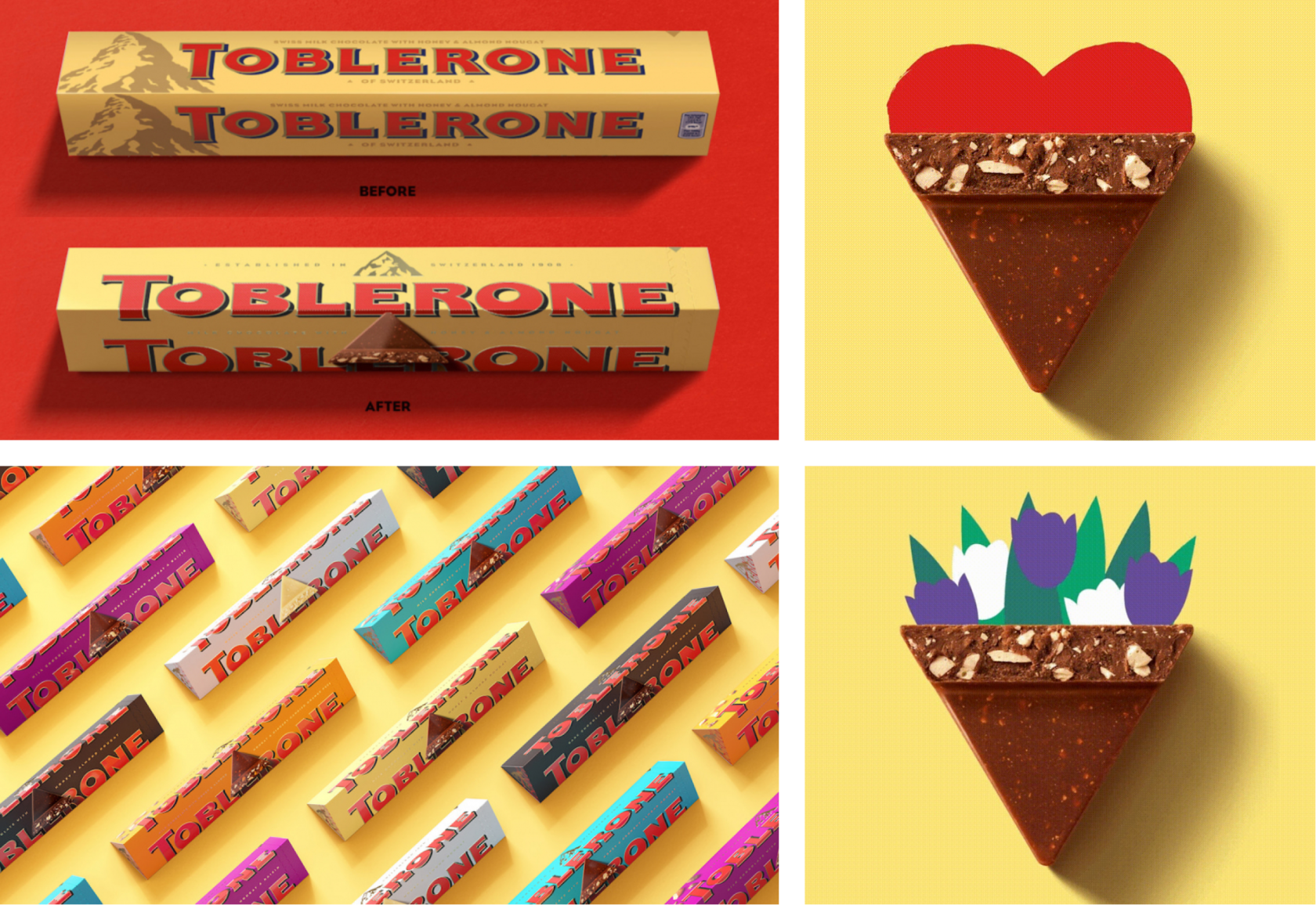
(1/13) Toblerone

– The company has updated the logo
– Expanded the corporate palette of products: classic colors remained in the palette and turquoise, orange and purple were added
– An image of a chocolate pyramid appeared on the packaging.
– A themed design for the holidays will also be placed on the packaging
Thus, the goal of the brand is to be more triangular.
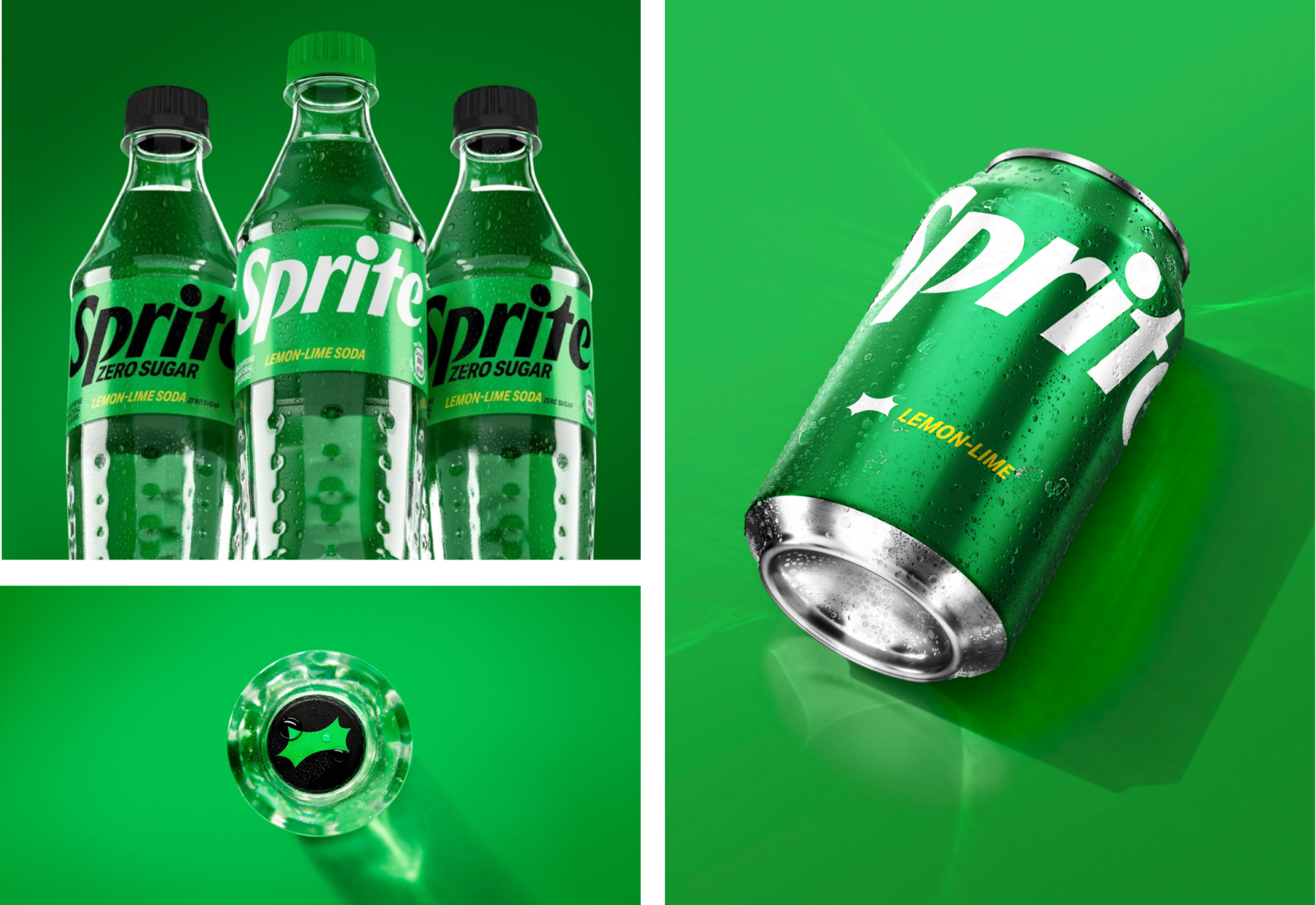
(2/13) Sprite
The font has leveled out and acquired a more minimalistic typography. The new font is bold and projects strength and youth to appeal to Generation Z consumers. This can be seen by the dynamics of the letters and the notch under the point of the letter "i".
The graphics on the Sprite packaging will retain their recognizable green hue. The packaging has also changed: now, instead of the green shade of plastic, the company will use transparent. This will simplify the packaging recycling process.
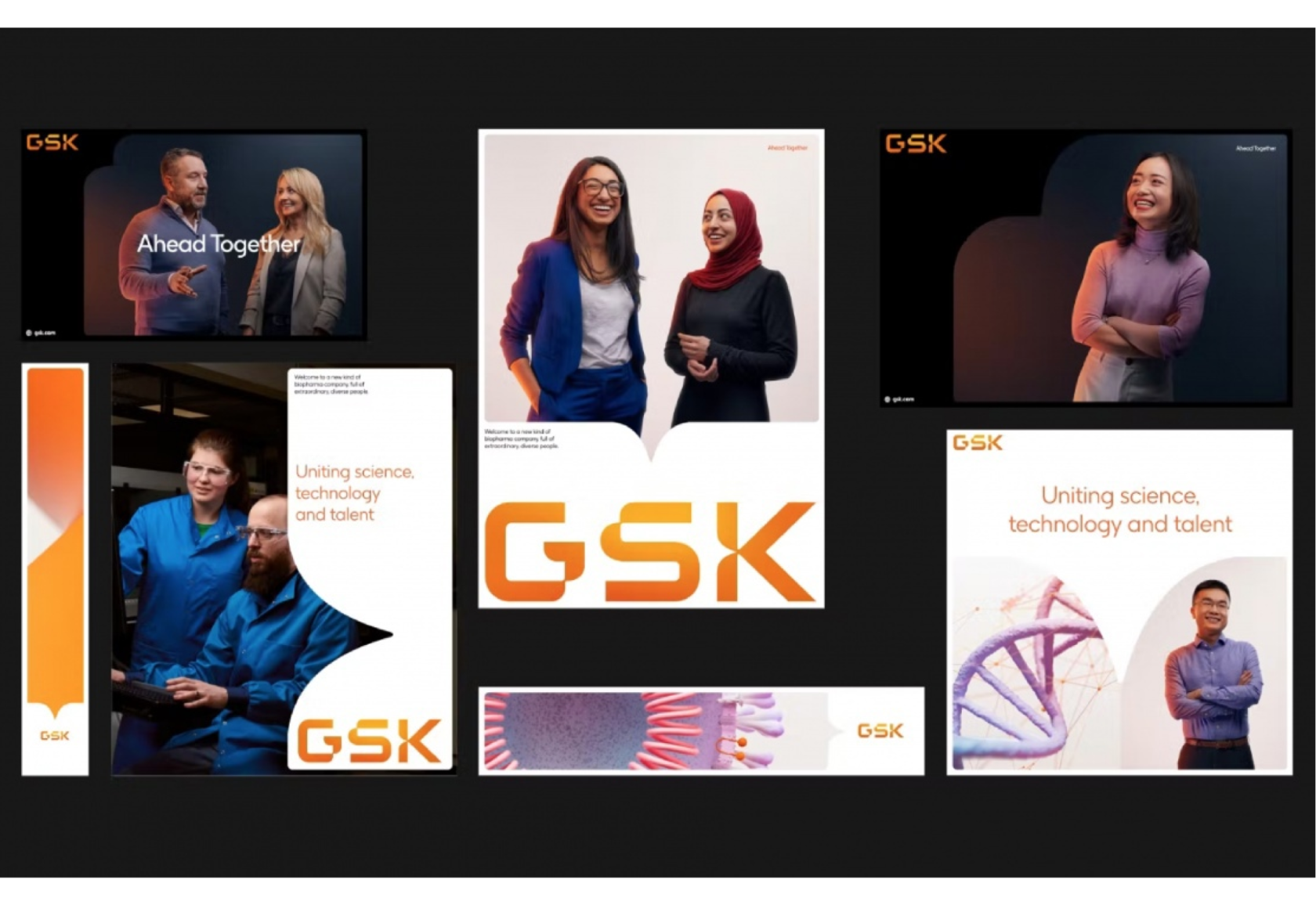
(3/13) GSK

Accessibility was a key focus for the rebranding, and the assets were tested for legibility in digital and print use. An individual font has been developed for the new identity by these accessibility goals. A set of animation graphics was also created.
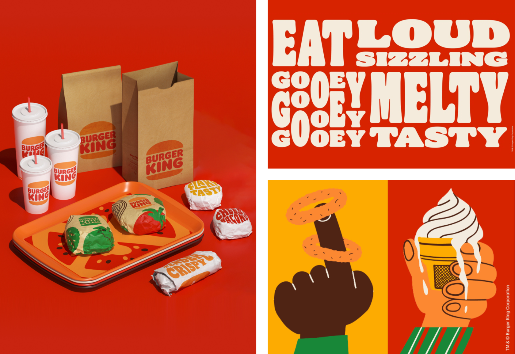
(4/13) Burger King

It will symbolize commitment to digital technologies, improved taste and quality standards for preservative-free products, and sustainability ambitions.
The logo has become more modern and adaptive for the digital format. The new minimalist style fits in seamlessly with the evolution of the brand, but at the same time pays homage to a longstanding concept: a confident, simple and fun design.
The chosen colors are rich and bold. They are inspired by fresh ingredients and the iconic fire cooking process. With relief texturing, the visual style enhances the sensory experience of the food.
Burger King's new font is called Fire. It's inspired by the chain's signature fire-grilled dishes - round, juicy, delicious - and fits in with the brand's daring nature.
Granted, that is a better logo than the previous one. It is in line with Burger King’s big and bold, playfully irreverent brand essence.
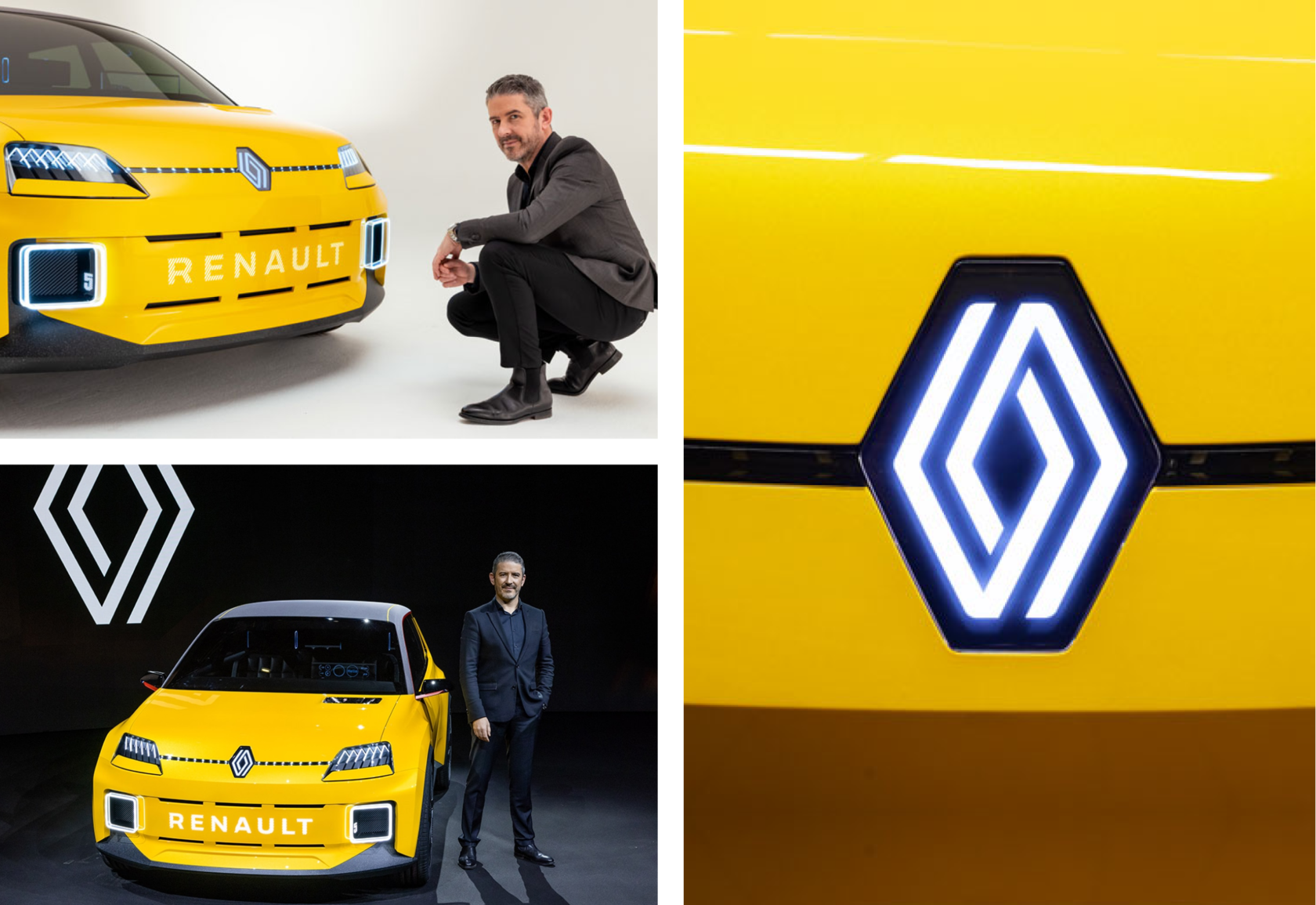
(5/13) Renault

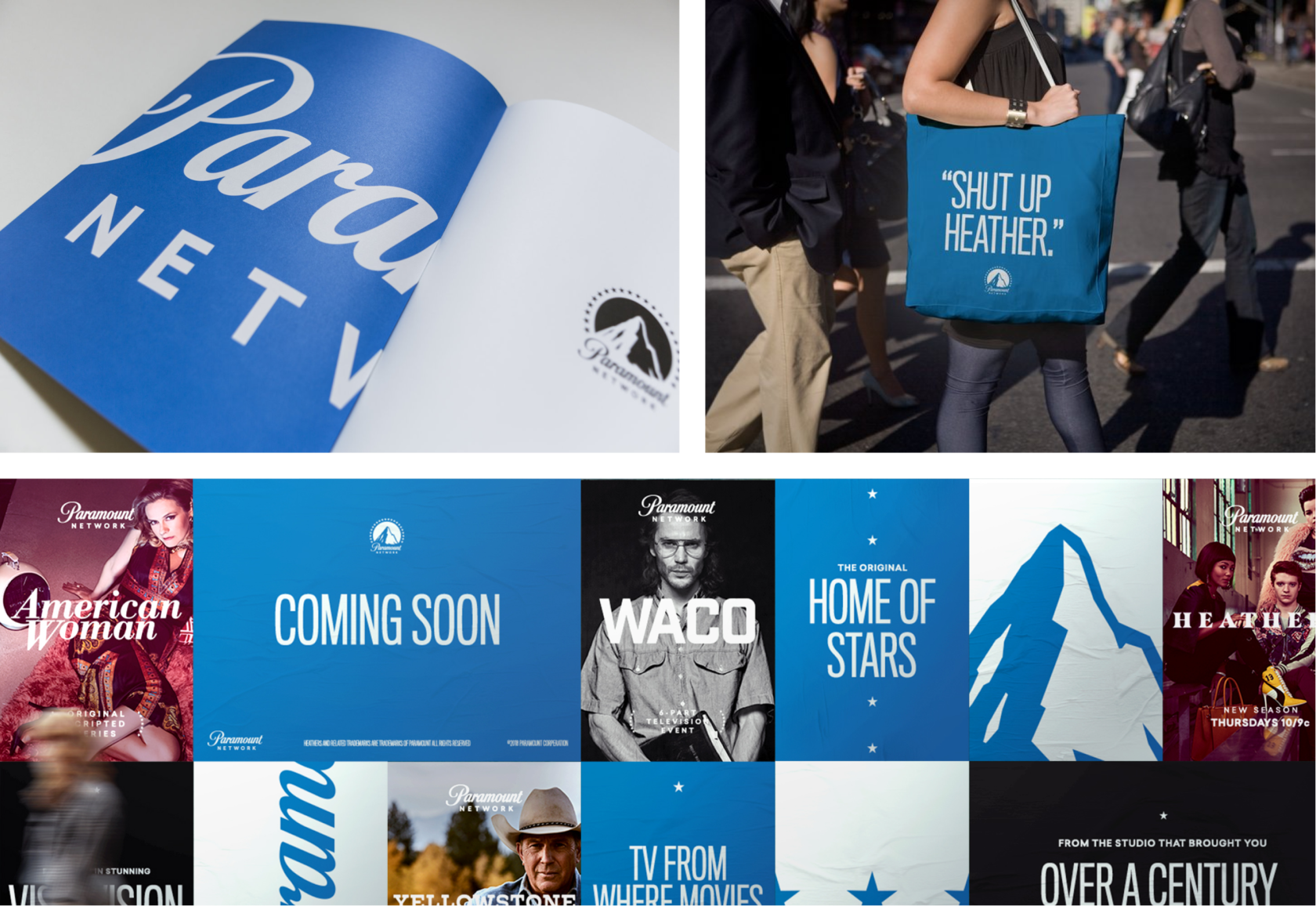
(6/13) Paramount

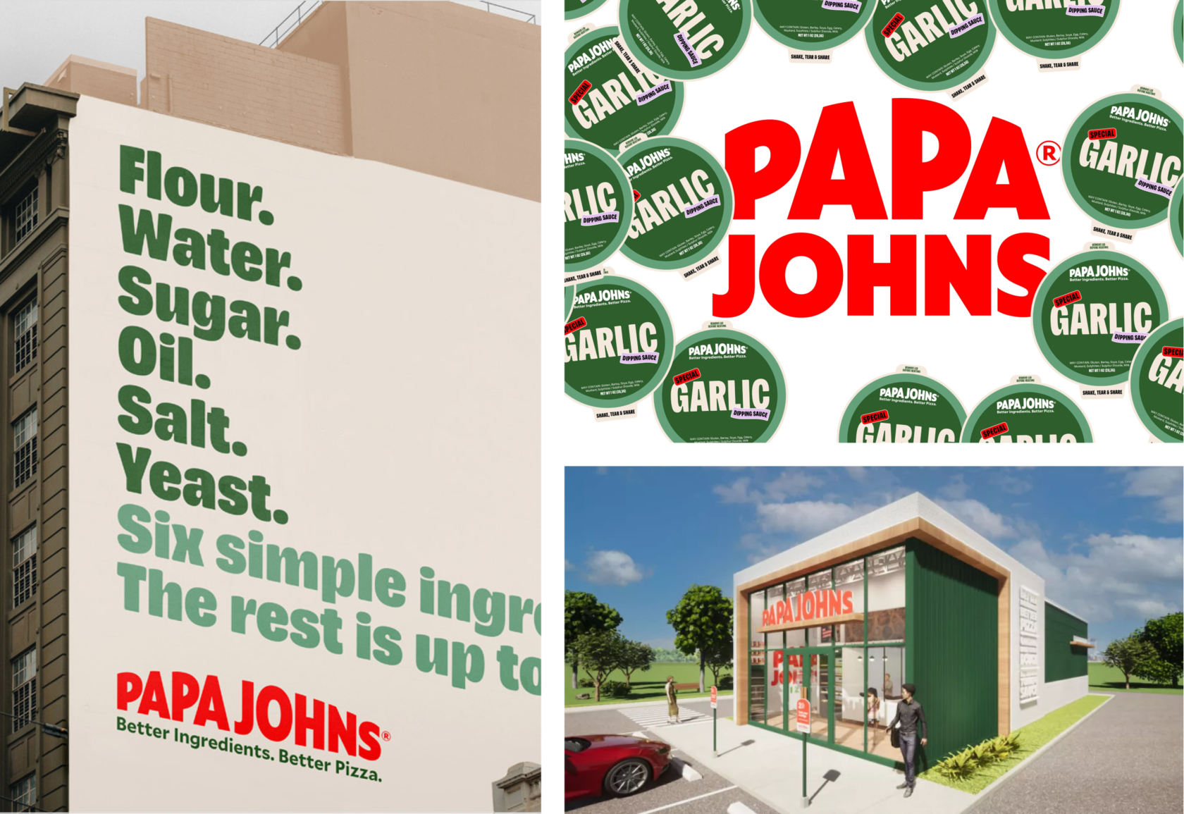
(7/13) Papa Johns

From a design perspective, the brighter sans serif and removal of the old border and subtitle make this a fresher logo all-round.
A new colour palette, meanwhile, includes Tangy tomato (red), Fresh basil (green) and Fluffy dough (off-white).
With new colors, typography and illustrations, the company received a completely new corporate identity.
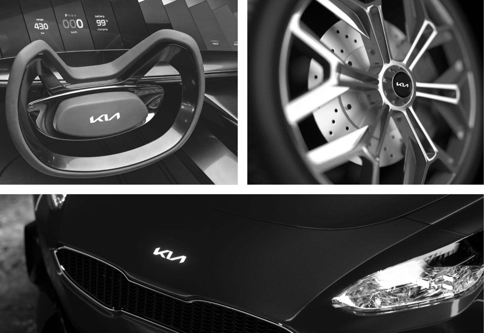
(8/13) KIA

Did Kia really need a new logo? Probably not. In the end, he became an automotive giant, despite the old logo.
But let's say you've never owned a Kia. In this case, the new logo - combined with the new slogan ("Movement that inspires"), the aggressive and relentless marketing that will follow, and their new car model - might make you think about buying.
From a strategic standpoint, the branding is a success as it will give Kia the attention it deserves, especially in the long run.
When it comes to design, we are immediately aware of the serious issue of legibility. It can easily be mistaken for "K" and "N" back instead of "KIA".
There is an "И" in Cyrillic, which can lead to an even bigger problem in specific countries. If you are unfamiliar with the brand, or exposed to this logo in a situation where it is not placed on the vehicle, you will find it difficult to understand the brand name, which defeats the very first purpose of every logo.
Kia is not a new brand and with repeated exposure, the problem should eventually dissipate, but that doesn't change the fact that the logo design is problematic.
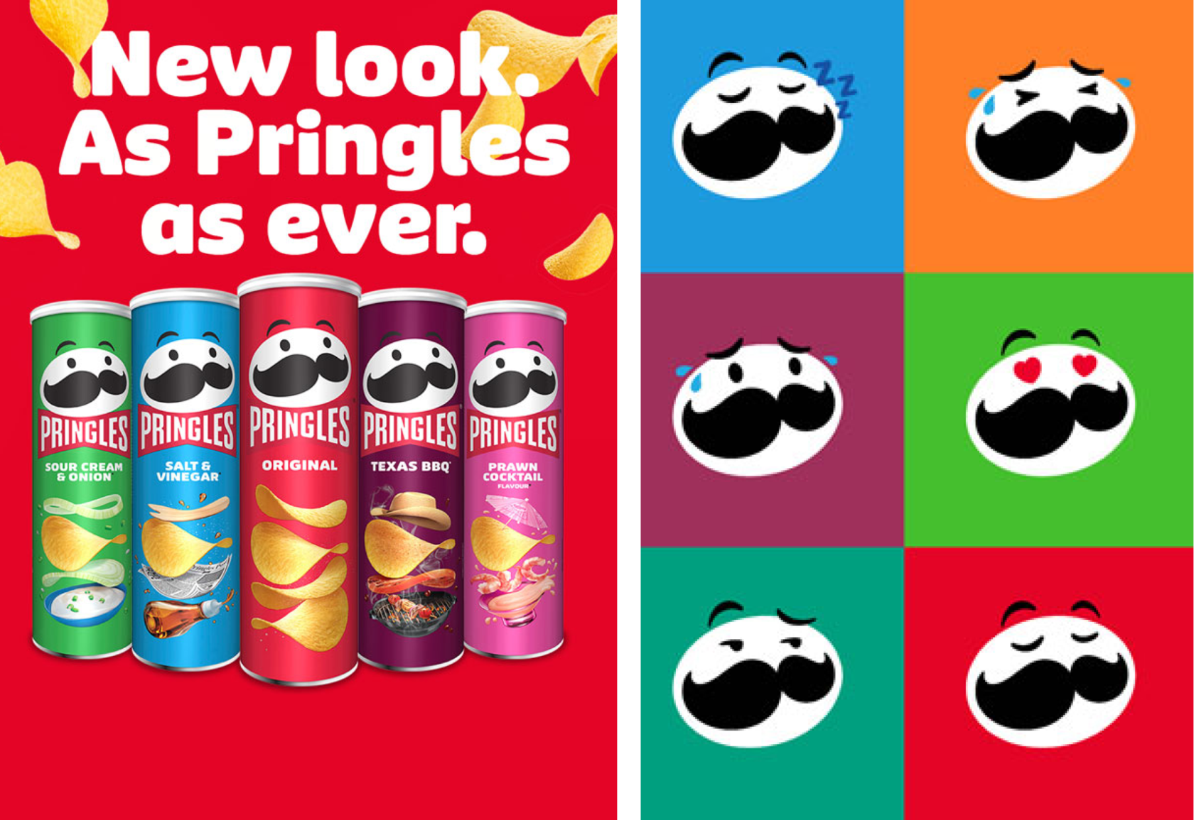
(9/13) Pringles

The new logo now has an expressive pair of eyebrows and an oversized red bow tie. An updated wordmark has also been designed, which is contained within the bow tie lock-up.
JKR creative director Della Lawrence explains that putting Mr. P front-and-centre of the new identity was crucial. “Our job was to bring him to life,” she says.
The new flat design also seeks to give the mascot a “new lease of life on digital”
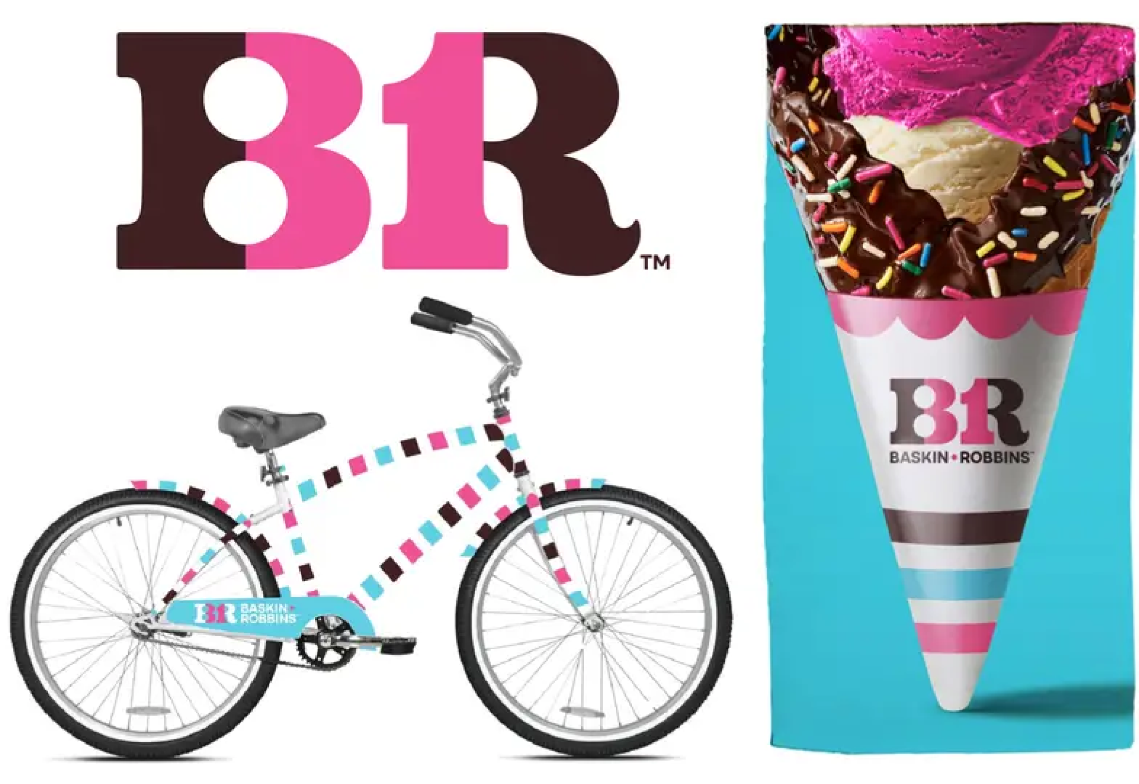
(10/13) Baskin-Robbins
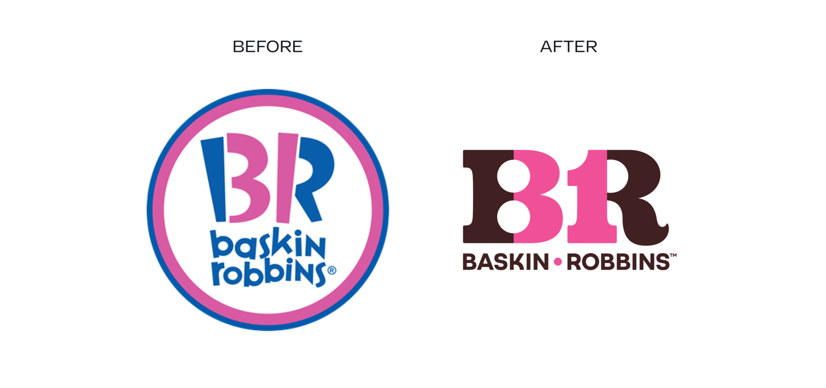
The new version of the logo refers to the classic slogan of the brand "31 tastes" (meaning that consumers can taste a new taste every day of the month). In it, we can note the appearance of a new corporate color, a bright emblem and the highlighting of the number 31.
(11/13) Ferrari


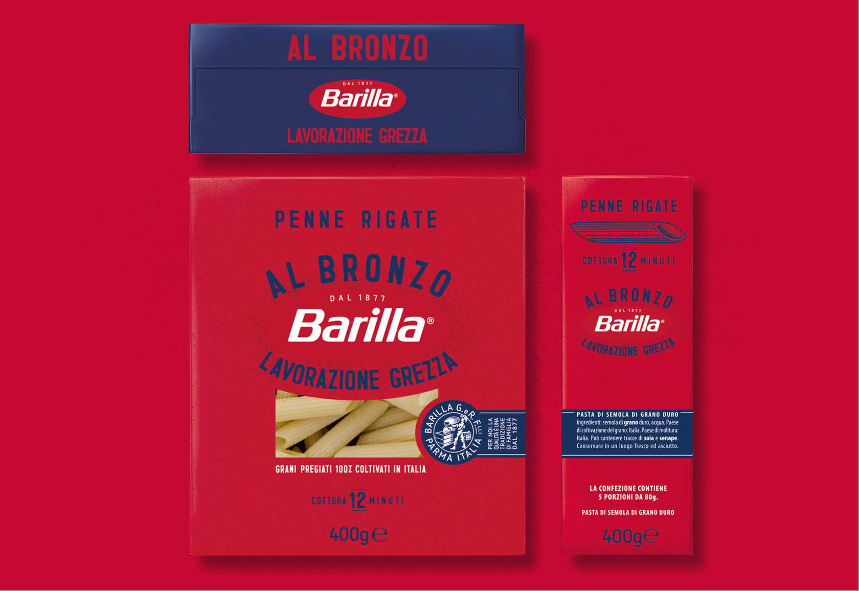
(12/13) Barilla

A stamp with the year of the company's foundation appeared in the logo, as well as a note about the processing of pasta with a special bronze nozzle (al bronzo), thanks to which the dish absorbs sauces better. In the corporate style, the company got rid of the image of the yolk, which referred to the traditional recipe for egg paste. This is due to plans to expand the product range.
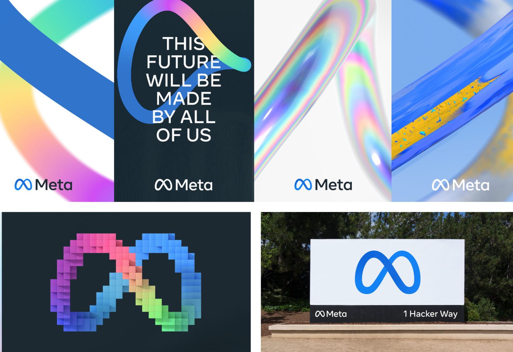
(13/13) Meta (formerly Facebook)

The logo is a blue ribbon that resembles both glasses and a Mobius strip, referring to the sign of infinity.
*All images and materials mentioned in this article belong to the brands mentioned.