If you’re looking to get maximum attention – and results – from your presentations in 2023, there are a couple of simple design principles you should be incorporating to make sure you get the desired result:
1. Use fewer slides
Less is more in this case – more visuals/graphics and less text. Can you even do without the text? When there is text on a presentation slide deck, it’s a basic rule of thumb that people don’t listen to the speaker and read instead.
It’s important not to overload the audience with unnecessary content. You should always keep in mind former Apple brand ambassador Guy Kawasaki’s ‘10/20/30 Rule’ - 10 slides that last 20 minutes in length, and have a font size no smaller than 30 points.

2. Choose your colour palette wisely
In a cultural moment shaped by countless challenges, Pantone’s color of the year for 2023 is a bold shade of red that speaks to the strength and vitality needed for forging a more positive future. PANTONE 18-1750 Viva Magenta, a vibrant and nuanced shade of crimson red, is a study in balances: drawing on both warm and cool tones, the color’s origins are grounded in nature with an electrifying hue that can be found in both the physical and virtual spheres, speaking to the diversity of our contemporary world.
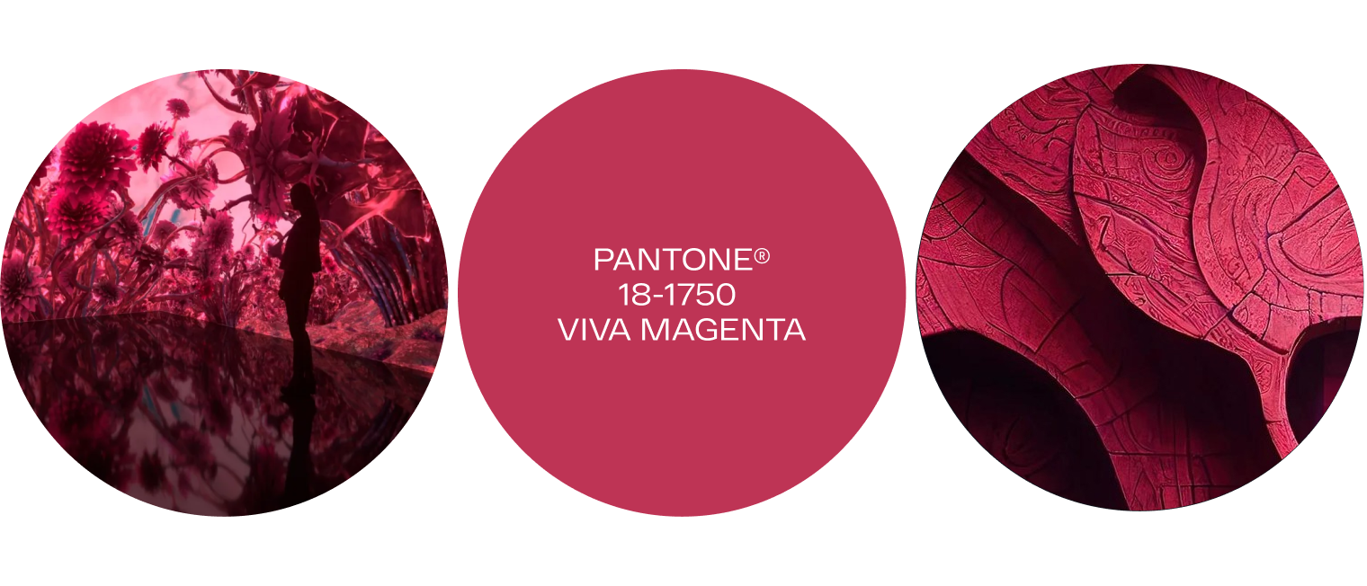
Artworks: pantone
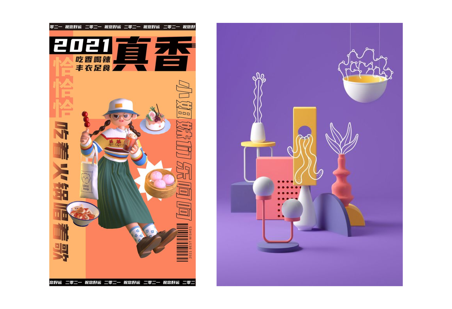
3. Try a 3D/2D mashup
Mashup is a process where different styles are combined to bring familiar materials to life. For example, a photo with an illustration, a collage of drawings of different styles, objects in different dimensions, and any other non-standard visual associations. In 2023, combine 3D with 2D and flat illustrations tin your PowerPoint presentation to get volume and accents.
This is a great opportunity to highlight important graphic elements in a presentation, and transform familiar objects (for example, graphs and diagrams).
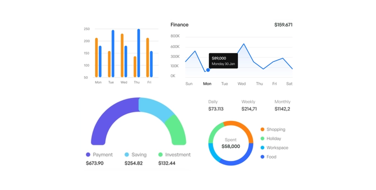
4. Get on the digital dashboard wagon
It’s easier for people to digest and understand information when they can see it. Dashboards are a great way of doing just this.
Here it’s important to structure the information, so that there are cards on one slide, united by a common message. Select graphs and diagrams that will help you talk - simply - about the complex.
5. Go handmade with your design
The Environmental, Social and Governance (ESG) agenda and its associated movement means we are now being more mindful of the way we design. What does that actually look like? It could be an illustrated printing house, imitation embroidery or plasticine products – and simulating them in a graphical editor.
The ESG framework is reflected in a renewed interest in manual typography to identity, packaging, posters, etc.
It’s especially important for companies that produce natural products and cosmetics as going handmade helps to emphasise the ethos and values of the company, the value and attention to each client, etc.
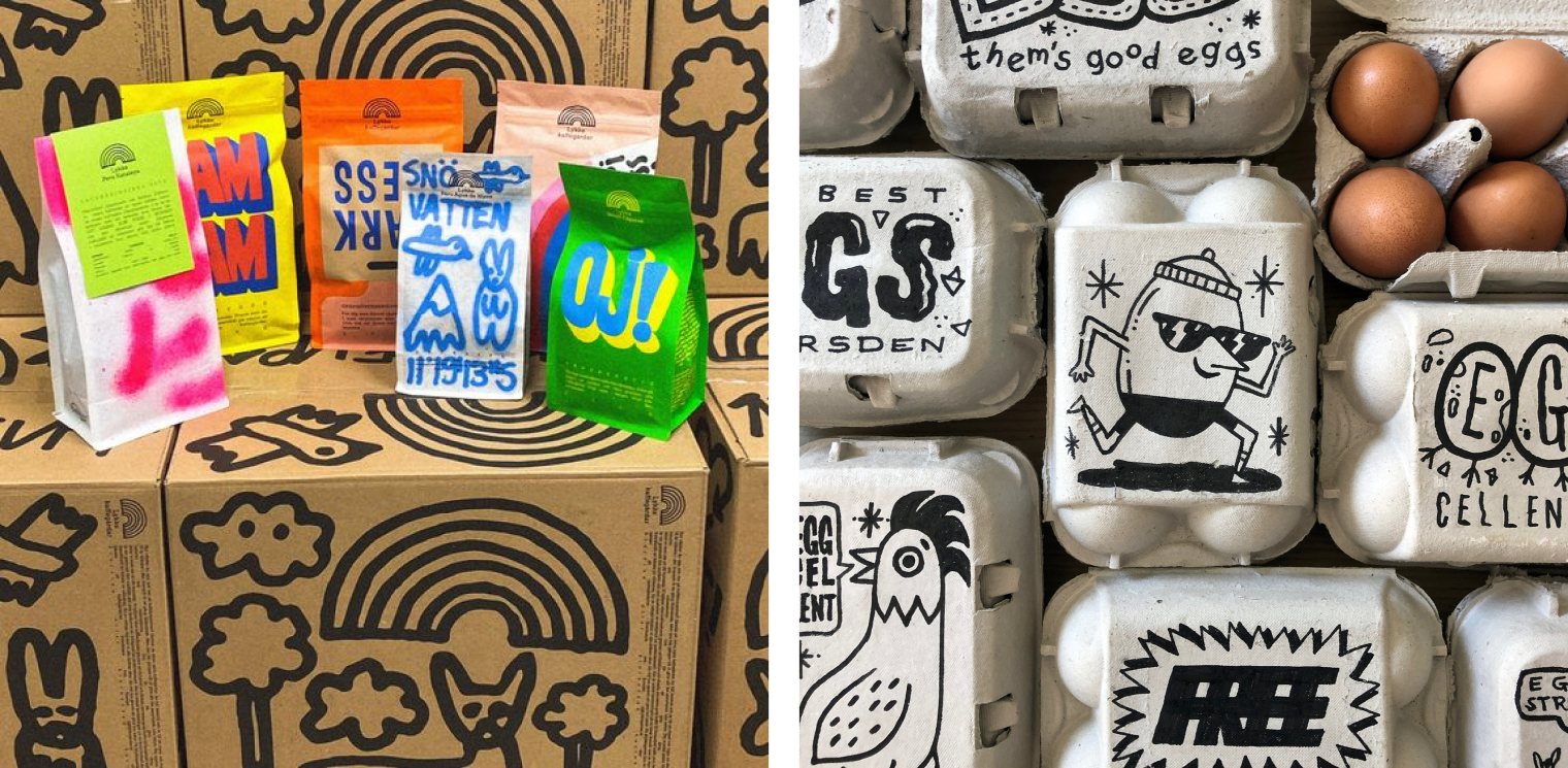
Artworks: lykkegardar and Woody Woods
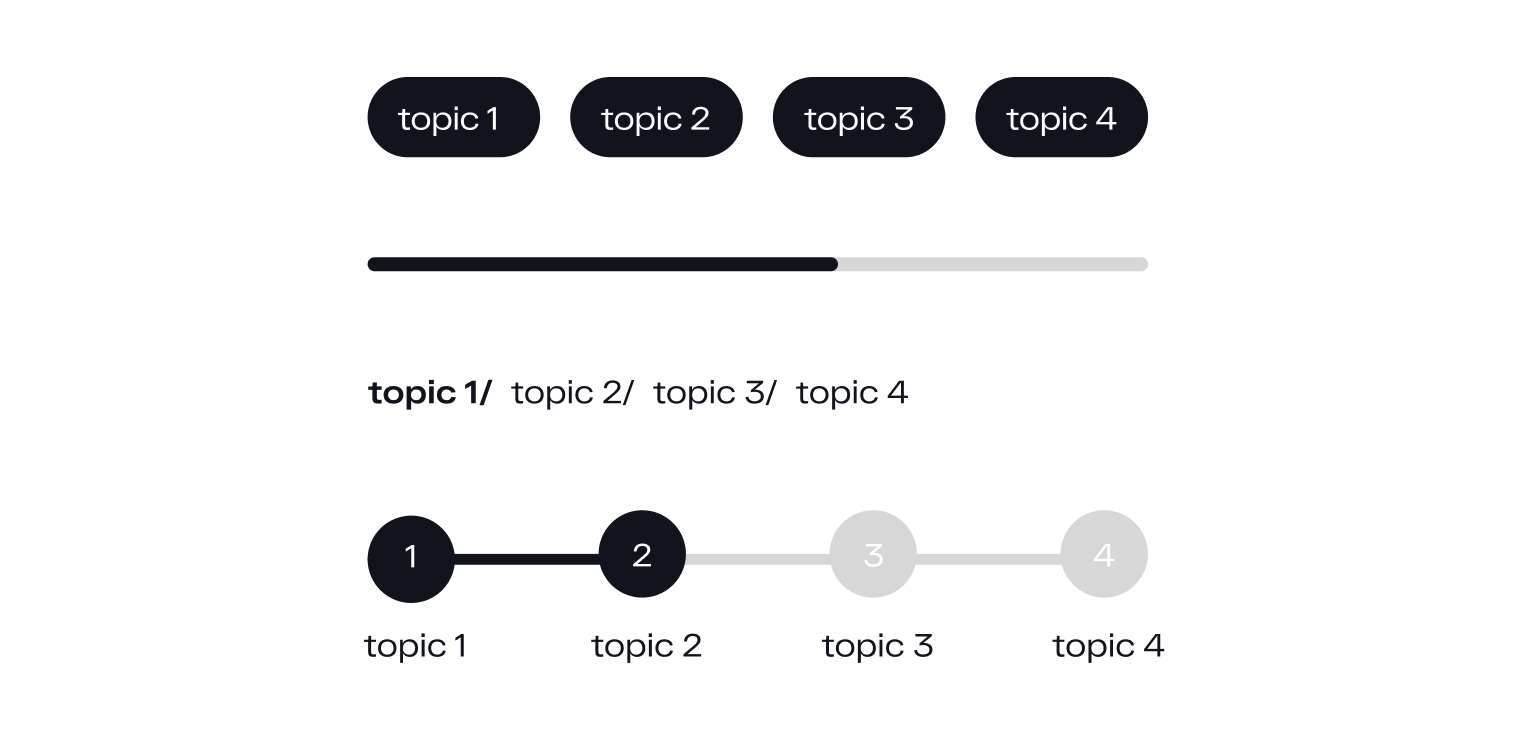
6. Shift your navigation from UX to UI
To make your presentations more user-friendly and accessible for navigation and perception, you can use the techniques adopted when creating user interfaces:
- Show the progress bar so that the audience can understand how much has already been watched, how much is left. This will help create expectations for the user about how quickly the presentation will take place and keep their attention.
- You can use breadcrumbs to facilitate the perception of which subsection the slide belongs to. This is especially necessary for presentations with a multi-level/complex hierarchy of presentation.
- If you have a complex presentation with a lot of topics – insert slide dividers between subsections.
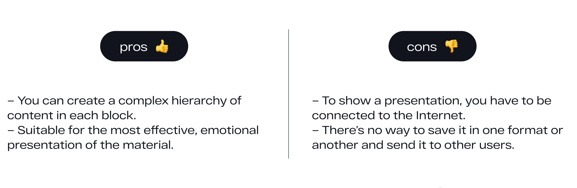
7. Update your tools for creating trending presentations
If you only use Keynote or PowerPoint, it's time for a makeover. Below are some popular ones right now – with a list of their pros and cons - that you could try.
Prezi
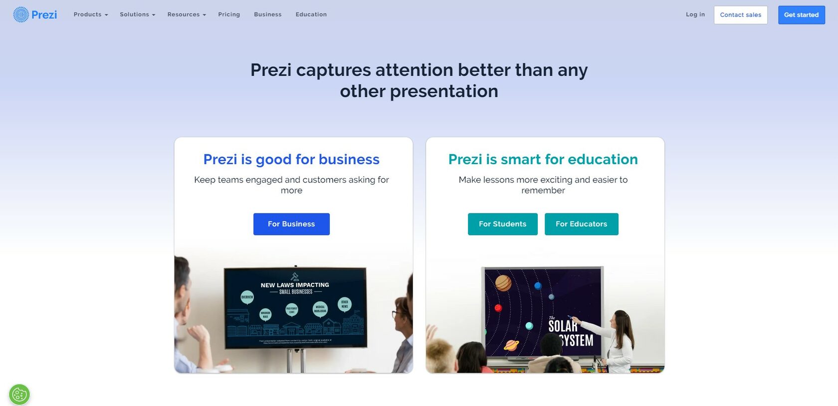
This is a cloud service that is tailored for integration with video conferencing systems: Zoom, Webex, and MS Teams. What’s great about Prezi is that it turns the presentation into what resembles a large, interactive whiteboard. This can be used not only when you need a change of slides one after the other, but also want interactive immersion in a journey through topics.
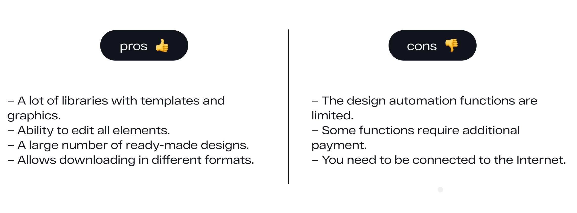
Canva
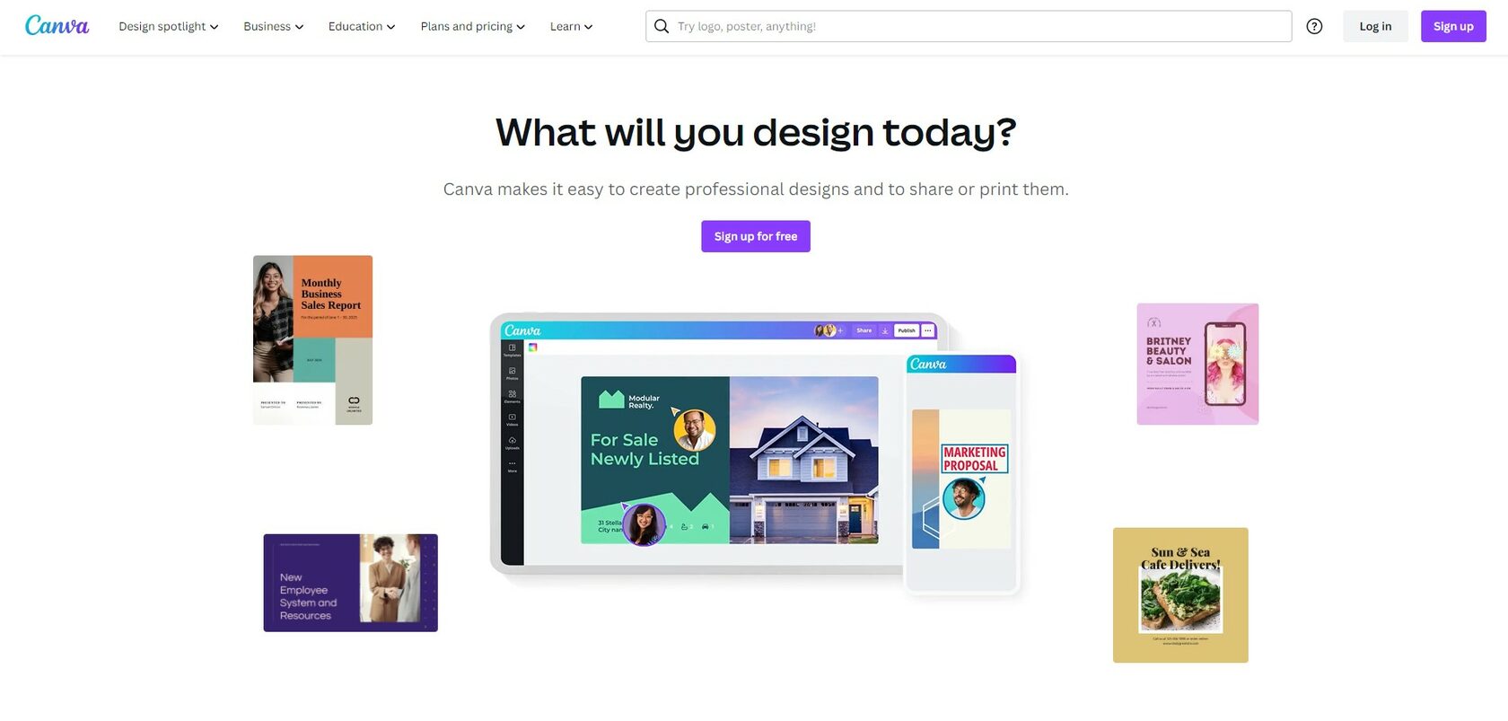
Canva is a universal design tool that’s suitable for everyone at all levels, from beginners to professional designers. It’s used mostly to create graphic materials.
Google Slides
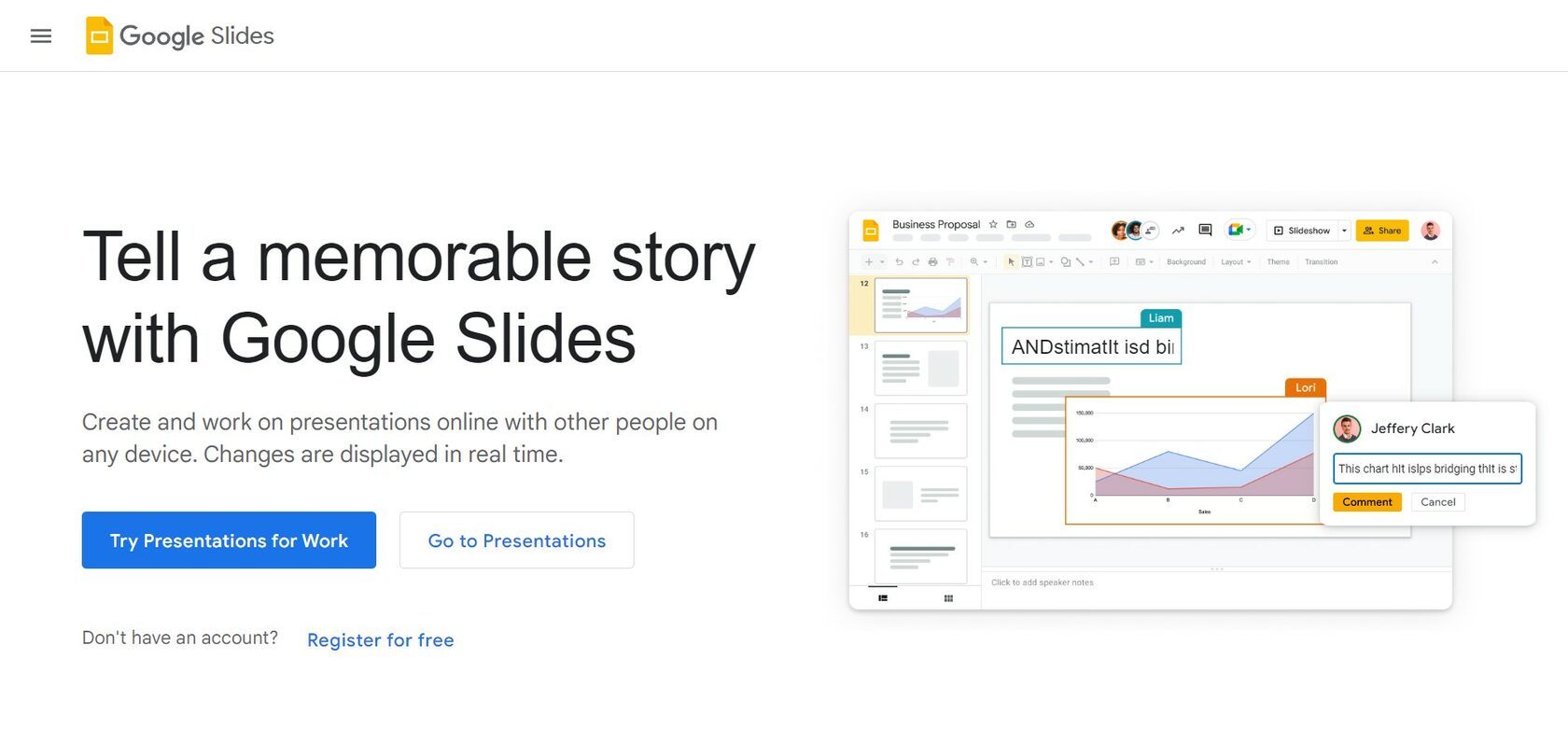
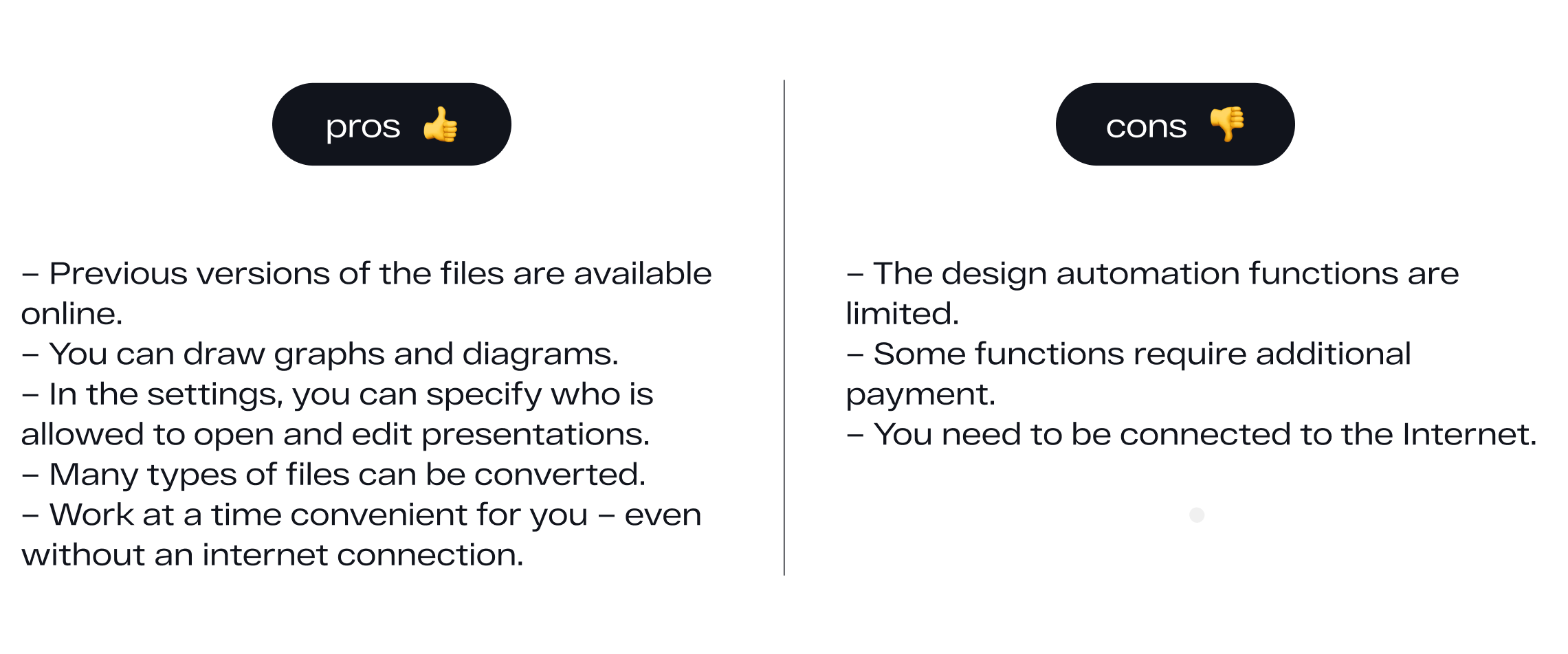
Google Slides presentation is a cloud service accessible from any computer connected to the Internet. You can also install a separate application. The program is compatible with various formats, and it’s also possible to convert files.